.png)
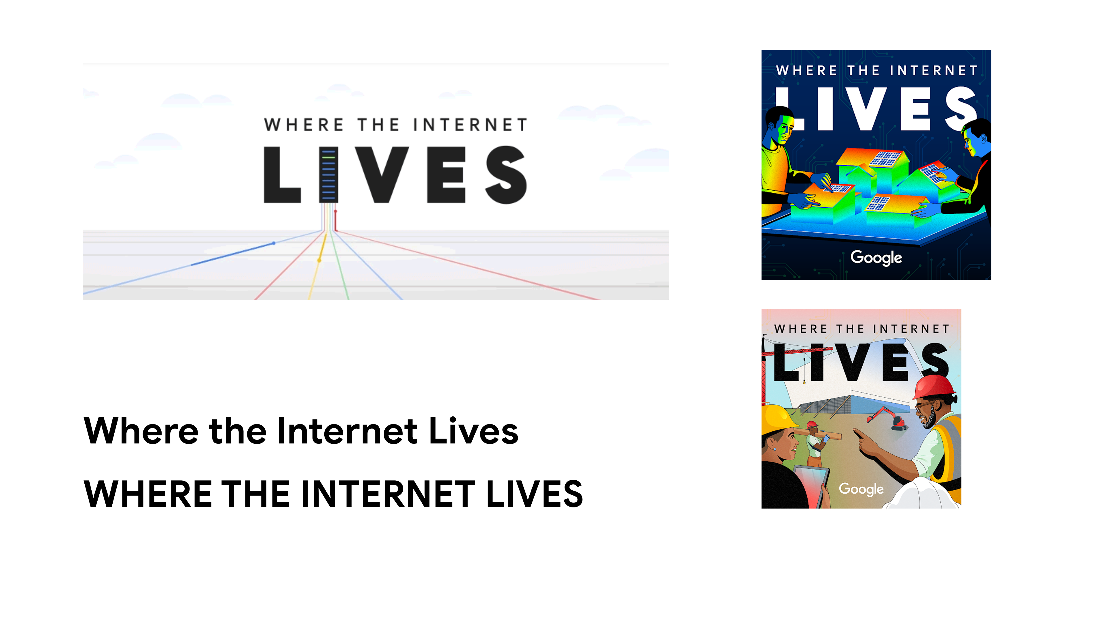
Google’s award-winning data-center podcast needed a stop-gap mark that read clearly at thumbnail size. The previous lock-up made the word Lives dominate while “Where the Internet” disappeared on episode art and social icons.
I created an interim logo that equalized the wording, tightened the typography, and fit effortlessly into Google’s brand palette. The mark rolled out on data-center caravan tours, season thumbnails, and event signage worldwide—and served as the show’s global identity for several months until a permanent rebrand was funded.
2023-2024
Interim Logo & Identity Refresh
Lead Designer
Concept & Typography
Asset Roll-out
_Page_1.jpg)
Google’s award-winning podcast and mini-doc franchise pulls back the curtain on the data-center world, yet its original word-mark collapsed at thumbnail size—the word Lives loomed while “Where the Internet” all but vanished.
I was asked to deliver an interim logo that could go live quickly across episode art, caravan-tour signage, and social media while the team sought budget for a longer-term rebrand.
My solution equalized the hierarchy, refined the typography, and locked the mark into Google’s core palette, providing a crisp, legible identity that served the show worldwide for several seasons.
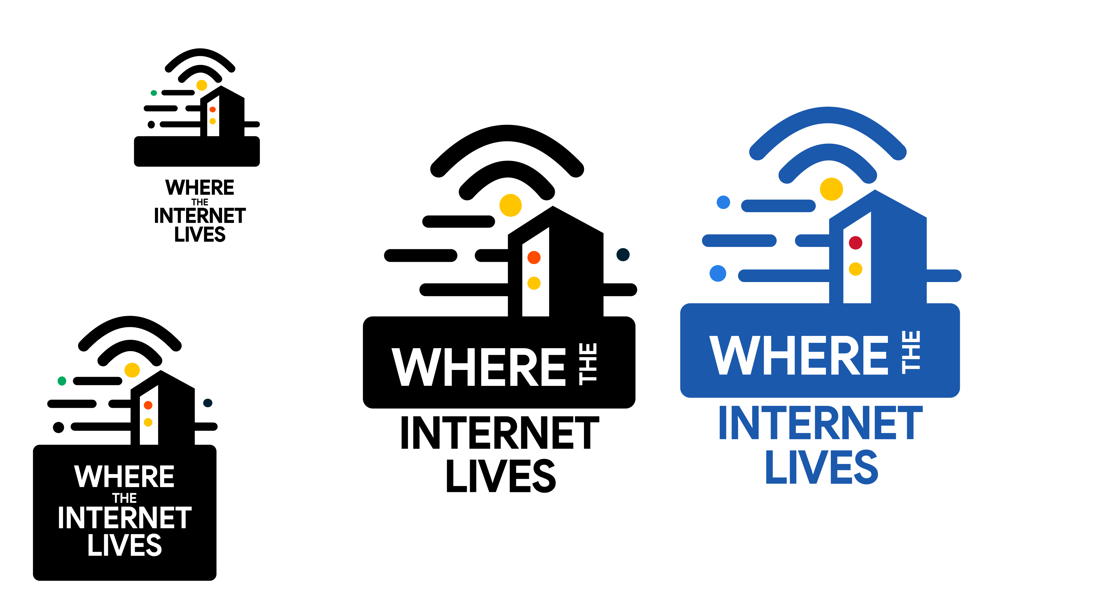
The existing lock-up used two font sizes and wide tracking, causing the title to break apart on small canvases such as podcast players, YouTube thumbnails, and enamel pins. Internally, teams were compensating with ad-hoc crops and color tweaks, creating visual drift. The brief was to craft a single, scalable logo—in less than two weeks—that would reproduce cleanly from 24-pixel favicons to eight-foot tour banners and feel unmistakably “Google” without a full design-system overhaul.
Lead Interim Logo & Identity Typography & Color
Asset Roll-out
Cross-team Coordination
To move fast, I ran a lean discovery sprint. I collected reference boards on Pinterest—ranging from podcast cover art and tech-brand word-marks to visual cues of data-center architecture like circuit lines, server-rack grids, and aerial “footprint” shapes.
I also audited how competing tech podcasts handle typography at postage-stamp sizes, then cross-checked listener demographics for Where the Internet Lives (tech-curious professionals and community members following Google’s data-center news). All research pointed to a single requirement: the full title had to stay legible in the tiny squares where most listeners first encounter the show.
Guided by that insight, I iterated through dozens of Google Sans word-marks—testing weights, spacing, and line breaks—while sampling Google’s four signature colors in different pairings. I mocked each option at common podcast and YouTube thumbnail dimensions, black and white favicons, and six-foot event banners to be sure the hierarchy held up everywhere.
The final lock-up balances all four words at equal visual weight, uses subtle kerning tweaks for clarity, and folds seamlessly into Google’s broader brand system.
.png)
My exploration began with a board that pulled equally from three sources: classic skilled-trades visuals (union badge silhouettes, blueprint grids, construction stencils); core Google brand language (the full blue-red-yellow-green palette, rounded geometry, Material-style layering); and symbols of upward mobility (apprentices in PPE, rising arrows, star points).
Instead of a 60-30-10 split, I leveraged all four Google hues in graduated tints to create a modular system: blue anchors the “S,” red forms the “T,” yellow radiates through the “A,” and green completes the “R.” Subtle tone-on-tone overlays give each letter a sense of dimensional “building blocks,” reinforcing the program’s trades focus while keeping the mark unmistakably Google.
_Page_2.jpg)
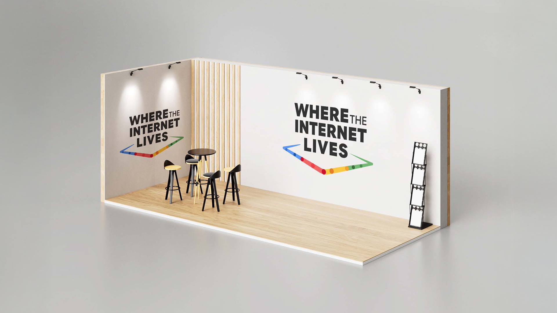

The word-mark went live in late 2023 with one goal: make the full title readable at a glance. By shrinking "the" and giving equal weight to the remaining words in Google Sans, the logo solved the hierarchy problem and stayed crisp even at thumbnail scale.
It accompanied the show on global caravan-tour graphics and podcast artwork for nearly a year—long enough for me to see it in person at a gala which featured Google’s travelling data-center exhibit, where it greeted guests on entrance panels and interactive kiosks. The interim mark gave Where the Internet Lives a clear, balanced identity until a fully funded rebrand team introduced the next version.