.png)
I led a comprehensive redesign showcasing TRG’s growth and ushering in a new era for the organization. The new site aligns with evolving business needs by streamlining navigation, highlighting core service offerings, and guiding mission-driven clients to tailored solutions through clear, user-focused pathways.
2021-2023
Training Resources Group, Inc
Art Direction, Identity, Website
Art Direction & Visual Design
Content Strategy
Research Collaboration
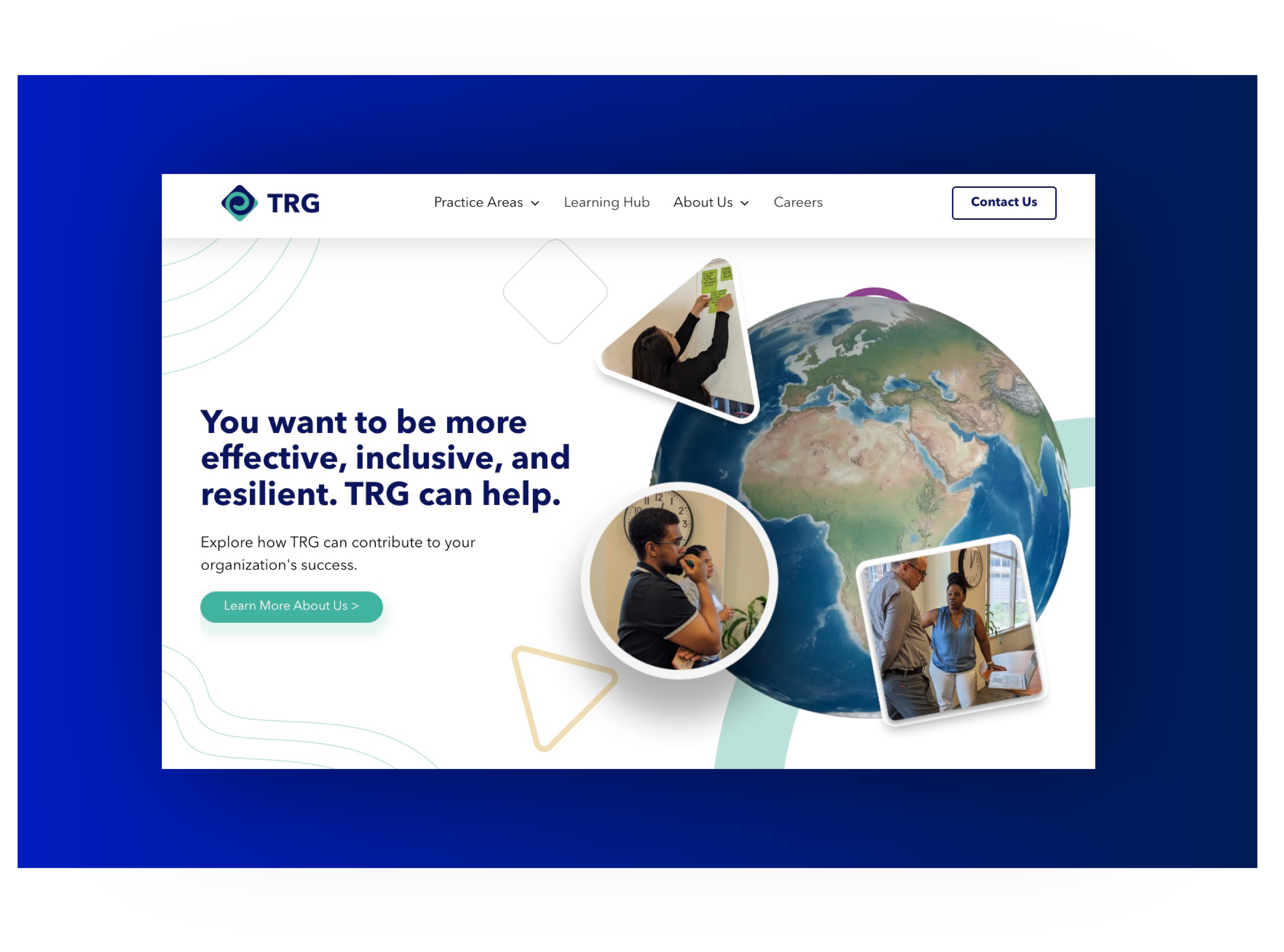
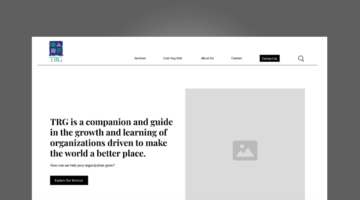
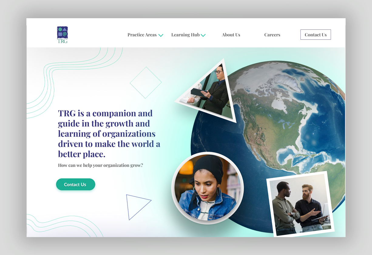
I rebuilt the Training Resources Group website to support two mission-critical goals: attract new clients/partners and recruit diverse, qualified talent. Guided by TRG’s vision of being a trusted companion in organizational growth, I re-architected the site so visitors can immediately see who TRG is, who we serve, and how to work with us. Plain-language service pages, clear calls to “Contact Us” and “Join Our Talent Pool,” and a Learning Hub that showcases TRG’s culture and thought leadership now turn the site into an active business-development and hiring channel.
The previous site buried key services in jargon, offered no obvious next steps, and lacked analytics to measure engagement. I streamlined navigation, rewrote copy in TRG’s warm-yet-direct voice, and designed goal-driven funnels that (1) increase Contact Us submissions, (2) drive clicks to BambooHR job listings, and (3) boost Learning Hub resource views—all while establishing a clear governance model for ongoing maintenance.
Art Direction & Visual Design
Content Strategy
Analytics & Conversion Goals
Governance Framework
Vendor Handoff
To launch the redesign, I returned to TRG—this time as an external contractor—partnering with a former colleague to lead stakeholder interviews with leadership, BD, and HR, and to audit site analytics. Our discovery surfaced two urgent needs: first, concise, plain-language service pages so mission-driven organizations can quickly grasp what TRG offers; second, clear conversion paths—an easy “Contact Us” funnel for new business and prominent links to BambooHR for recruiting talent.
We also learned visitors cared most about TRG’s collaborative culture and real-world impact. That insight drove a new content strategy: elevate case studies, Learning Hub resources, and candid, people-focused imagery while stripping out jargon. These findings shaped the revised site map, page hierarchy, and brand voice that anchor every other phase of the redesign.
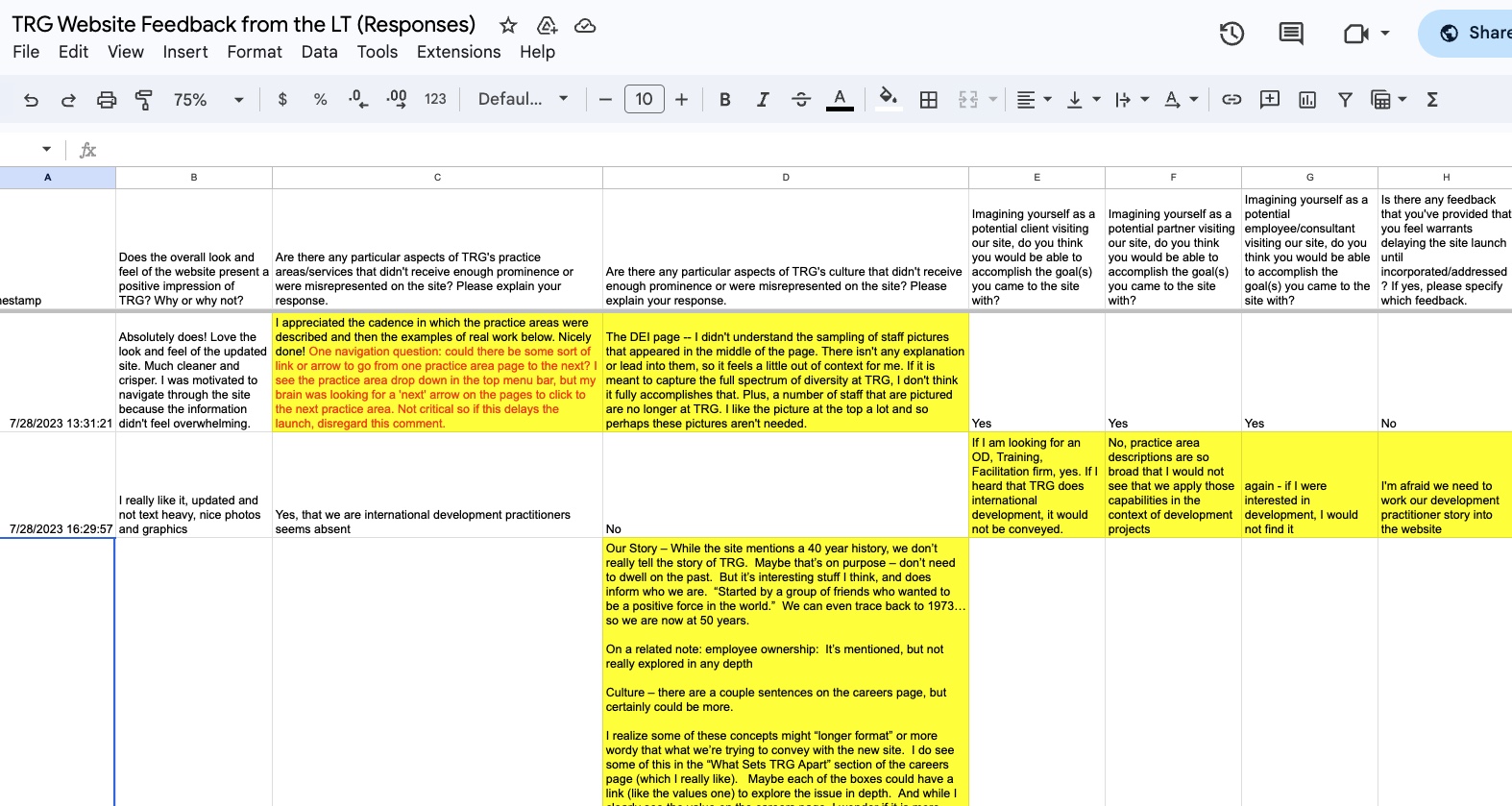
Leading the effort—and collaborating closely with a former TRG colleague—I conducted a forensic review of the legacy WordPress site. Together we mapped every page, pulled Google Analytics, and ranked traffic by click-through rates, search terms, and user flow. The data revealed visitors stalling on jargon-heavy service pages and dropping off before reaching the “Contact Us” form or BambooHR job listings.
With these insights, I reorganized the content hierarchy, while my collaborator provided additional validation: we trimmed technical language, surfaced plain-language overviews, elevated the key CTAs (“Contact Us” and “Join Our Talent Pool”), and rebuilt navigation around the real journeys of prospective clients, partners, and recruits.
As part of my user-centered design process, I created detailed personas and mapped their end-to-end journeys to be sure every page, message, and call-to-action answered real prospects’ questions and nudged them toward the next step.
Persona Development (UX best practice)
Drawing on analytics, BD/HR interviews, and TRG’s external-comms strategy, I distilled our research into three primary personas—each representing a priority audience for business development or recruiting.
Journey Mapping (UX best practice)
For each persona, I charted a visit from first click to final conversion—pinpointing the moments where clear language, social proof, or a well-placed CTA would move them forward. These maps validated our site architecture and informed placement of “Contact Us” and “Join Our Talent Pool” funnels.
Sample Personas:
Emily Chen
Age: 34
Occupation: Program Officer, USAID Global Health
Primary Goal: Identify experienced, trusted partners for capacity-building projects and quickly gauge TRG’s track record with USAID.
-
Carlos Reyes
Age: 45
Occupation: Business-Development Director, Mid-size NGO
Primary Goal: Vet TRG’s reputation and past performance, then initiate a partnership conversation for an upcoming bid.
-
Priya Patel
Age: 29
Occupation: Learning & Development Specialist exploring new roles
Primary Goal: Assess TRG’s mission alignment and inclusive culture, then seamlessly access open positions via BambooHR.
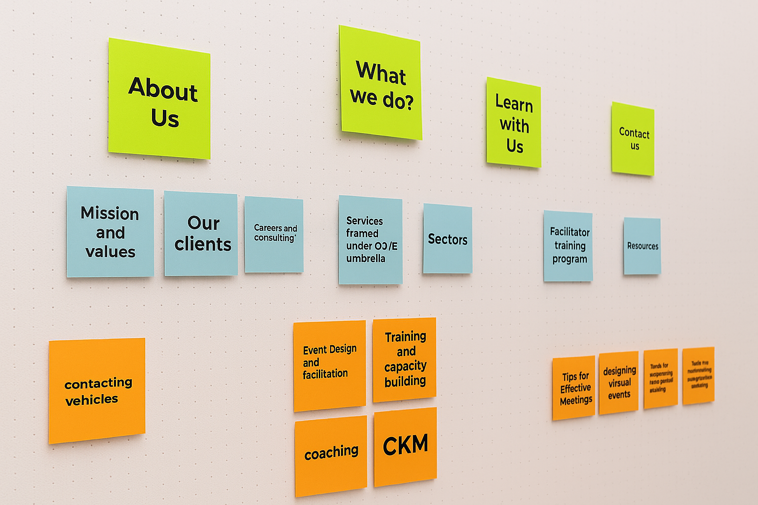
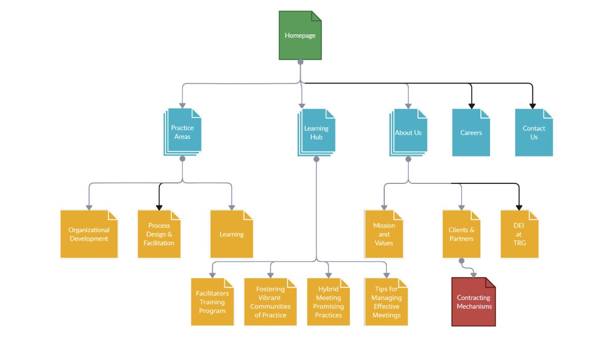
To ensure the site truly served community members, a colleague and I collaborated on mapping out the site architecture based on research findings and stakeholder input. We looked closely at common user needs—like learning about job opportunities, understanding local economic impact, and easily finding nearby data centers—and used those as anchors for the structure.
We iterated on several sitemap versions, continuously referencing UX principles and testing how the navigation would support a natural user flow. Every decision was deliberate: we focused on clarity, relevance, and ease of access, making sure the final structure reflected the priorities of the audiences we identified. The result is a sitemap designed to guide users intuitively through the content, with clear entry points for community-specific information.
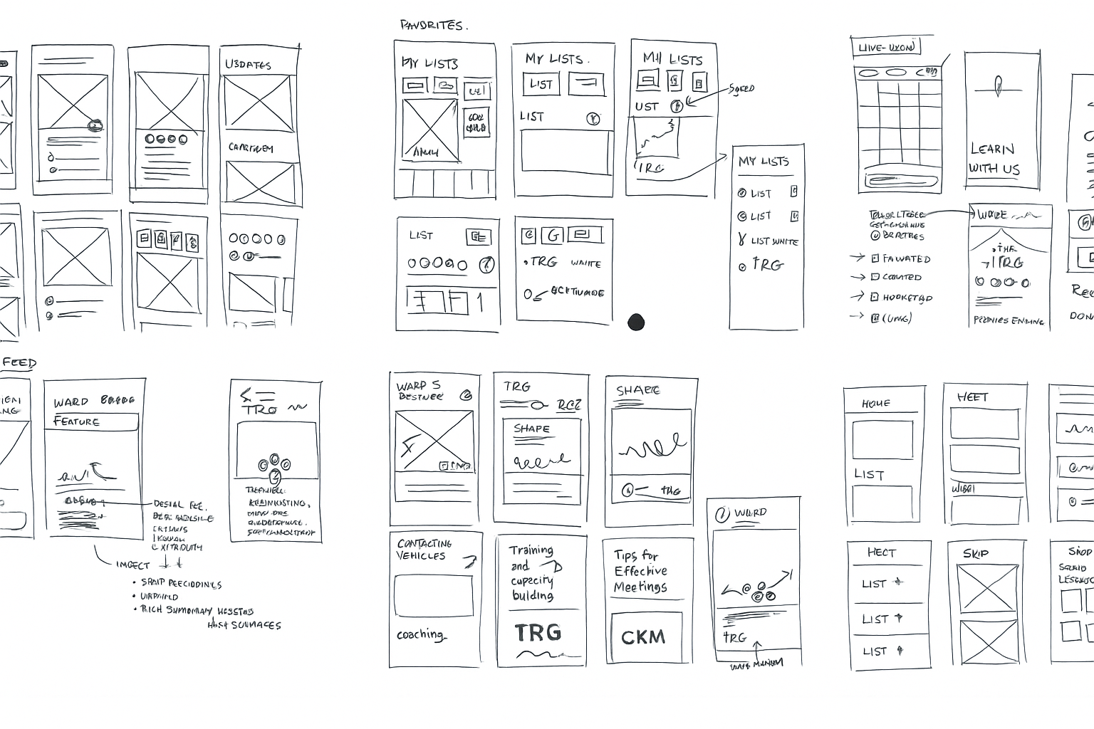
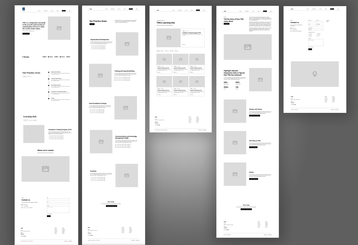
Building on the new site map, I created low-fidelity wireframes in Figma to translate TRG’s content strategy into a user-friendly layout. These sketches tested placement of plain-language service overviews, prominent “Contact Us” and “Join Our Talent Pool” calls-to-action, and a modular Learning Hub—all mapped to the journeys of our three priority personas (prospective partners, clients, and recruits).
Once validated with TRG’s Communications Committee, HR, and BD teams, the wireframes became a blueprint for Webflow development—ensuring accessibility, simplicity, and story-driven visuals while leaving room for future content growth. Every element—from hero messaging to footer links—was tailored to guide visitors smoothly toward partnership or hiring conversations.
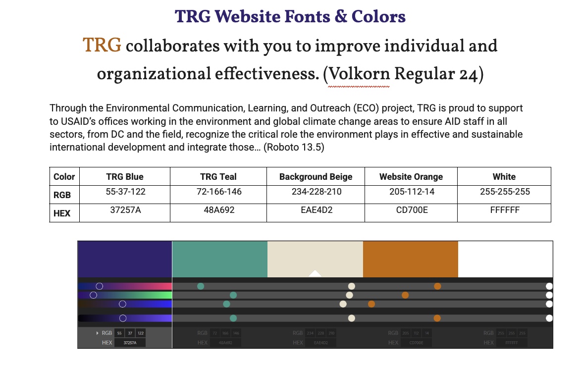
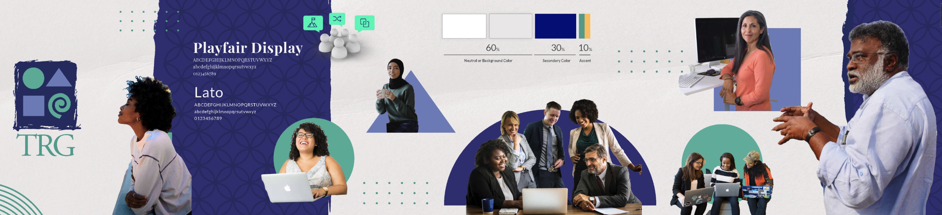
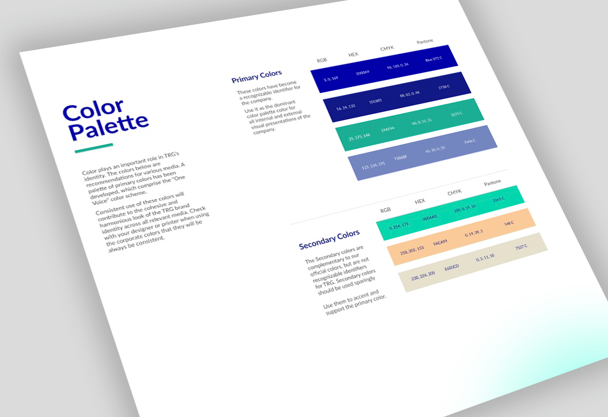
To translate TRG’s refreshed brand into a living interface, I built a complete visual system in Figma—beginning with mood boards and reference research, then iterating on color, typography, and iconography. Applying the 60-30-10 rule, I anchored every page in TRG Blue (30 %) set against generous white space (60 %) and a purposeful 10 % accent to spotlight calls-to-action. Palette choices weren’t decorative: each hue was tested for contrast, accessibility, and its ability to guide the eye toward “Contact Us” and “Join Our Talent Pool.”
For typography, I paired Playfair Display for headlines—lending a confident, editorial tone—with Lato for body copy, ensuring warmth and readability across devices. Organic, rounded shapes weave through backgrounds and cards, echoing TRG’s collaborative ethos, while candid, people-focused photography reinforces the “empowering people” narrative.
After design reviews with the Communications Committee and leadership, I codified the system into a style guide: color swatches, type scales, component specs, and photo guidelines—giving Webflow developers and future content creators a clear, consistent blueprint.
.png)
Once the site and style guide were complete, I expanded the system into a social-media toolkit—ready-made LinkedIn templates, image ratios, and post-copy guidelines—so TRG’s Communications Committee could promote resources and job listings with the same cohesive look and feel. The redesigned site and toolkit launched in 2023, handing staff full control over web updates and outreach.
Note: In the wake of sector-wide budget cuts affecting many USAID partners, TRG’s operational future is uncertain. Nevertheless, the brand framework and digital assets stand as proof of how strategic design can elevate mission-driven work, even in challenging times.