.png)
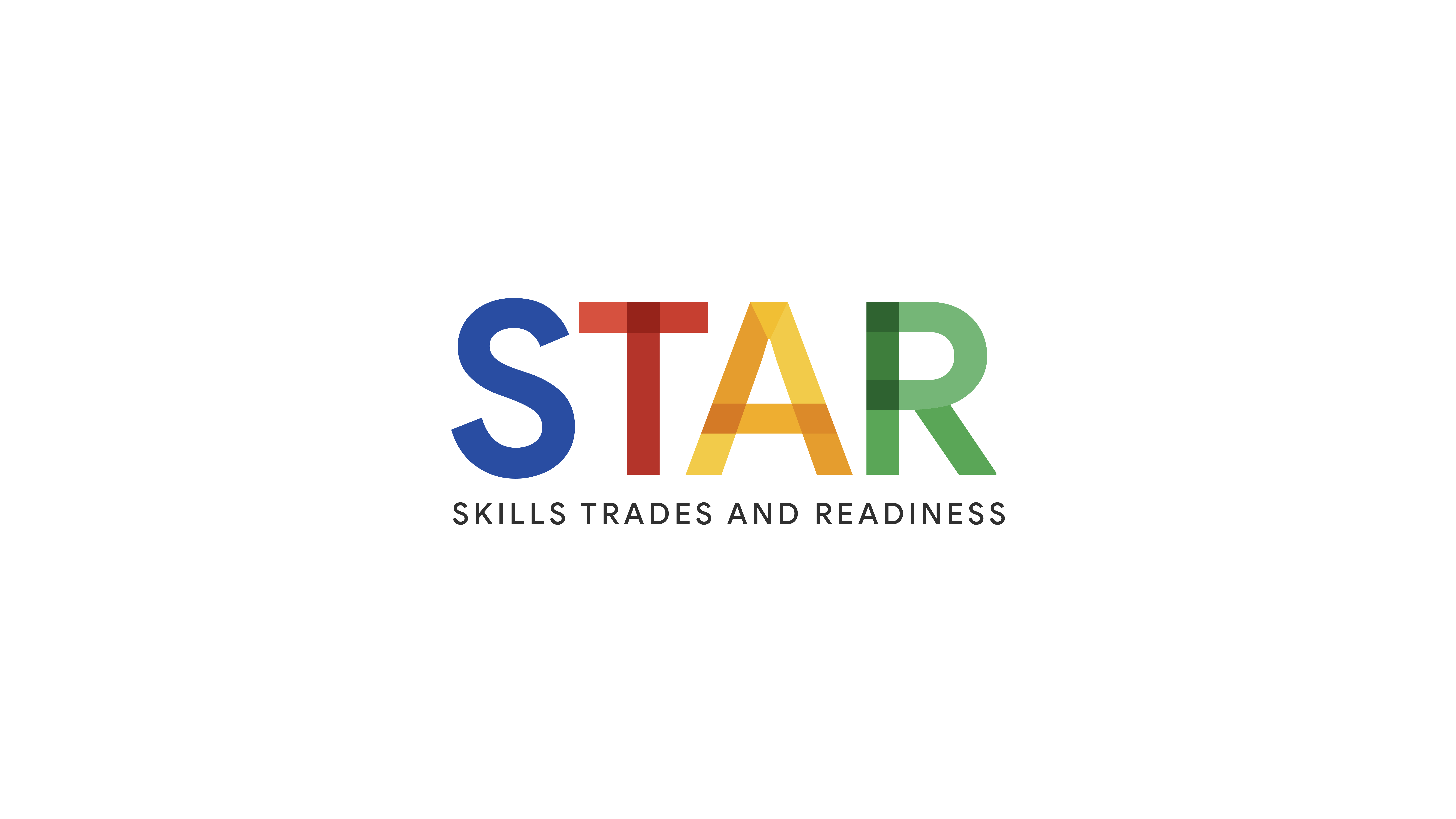
A concise visual identity for STAR—Google’s five-week training that prepares diverse newcomers for careers in construction. The mark fuses interlaced letterforms with Google’s four signature colors, hinting at building blocks and blueprints while signalling opportunity and inclusion.
2024
Logo & Identity Design
Lead Designer
Concept Development
Workforce-Dev Collaboration
Google’s Skilled Trades & Readiness (STAR) initiative lacked a unified visual presence—internal teams rotated through ad-hoc wordmarks and mismatched flyers. I was brought in as lead designer to create the first official logo and a compact brand kit that would work across event swag, social graphics, and the Data Centers website. The new mark, built from interlaced letterforms in Google’s core palette, now anchors every STAR touch-point—from hard-hat stickers to recruiting decks—and signals an inclusive pathway into construction careers.
Because STAR had launched without a formal identity, teams improvised—using piecemeal word-marks, off-brand colors, and one-off flyers that looked unofficial next to other Google programs. My brief was to replace this patchwork with a professional, scalable logo and a mini brand system that anyone on the Workforce-Development team could deploy for event signage, swag, social posts, and the Data Centers website—ensuring every audience encounters a clear, consistent visual signal for the program.
Lead Logo & Identity Design
Brand Guide Creation
Collateral & Swag Templates
Ongoing Asset Support
To ground the logo in real-world needs, I began with a discovery sprint: auditing competitor marks from trade unions, apprenticeship programs, and other tech-backed workforce initiatives; interviewing Google’s Workforce-Development team; and reviewing participant profiles for the STAR pilot cohort—new, often underrepresented job-seekers eager for a trusted path into construction.
Two insights stood out: the identity had to feel both aspirational (a Google-level stamp of opportunity) and immediately legible to people who may have never set foot on a high-tech campus. Those findings shaped every design decision—from interlaced, block-like letterforms that evoke blueprints and building blocks to the use of Google’s core palette as a signal of inclusivity and upward mobility.
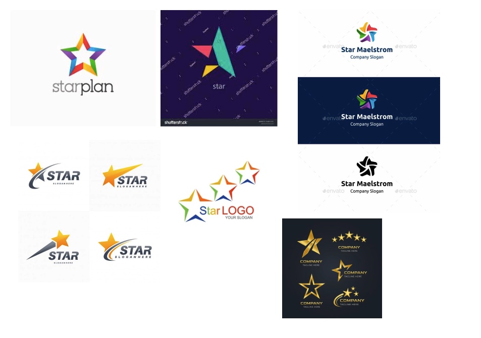
My exploration began with a board that pulled equally from three sources: classic skilled-trades visuals (union badge silhouettes, blueprint grids, construction stencils); core Google brand language (the full blue-red-yellow-green palette, rounded geometry, Material-style layering); and symbols of upward mobility (apprentices in PPE, rising arrows, star points).
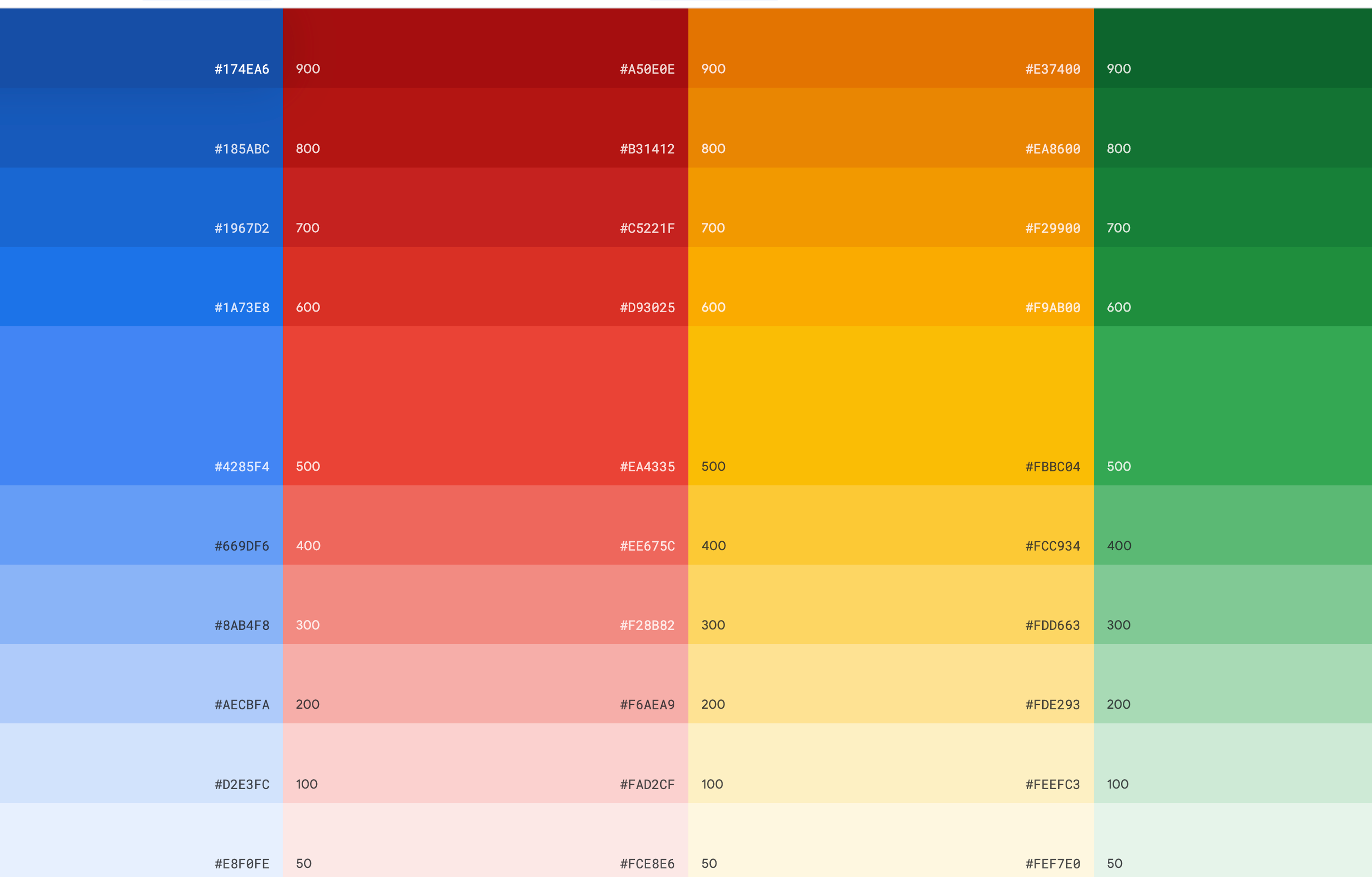
Instead of a 60-30-10 split, I leveraged all four Google hues in graduated tints to create a modular system: blue anchors the “S,” red forms the “T,” yellow radiates through the “A,” and green completes the “R.” Subtle tone-on-tone overlays give each letter a sense of dimensional “building blocks,” reinforcing the program’s trades focus while keeping the mark unmistakably Google.


Low-fidelity sketches tested pin, badge, and monogram ideas before two directions went to stakeholder review. The winning concept—interlaced letterforms that read as both building blocks and a guiding star—proved crystal-clear from 16-pixel favicon to eight-foot banner. I vector-refined the mark, stress-testing legibility across every size and background.
With the logo approved, I produced a turnkey asset suite: an event kit of pull-up banners, table throws, and hard-hat stickers; a swag pack featuring enamel pins, water-bottle decals, and pocket notebooks; and digital templates for LinkedIn headers, video thumbnails, and Google-Slides decks. Each file shipped print-ready with usage notes, enabling non-designers to order swag or refresh promos independently.
The new STAR identity debuted at Google’s 2024 Workforce Summit and now anchors the program’s presence on the Data Centers website, recruiting decks, and field-training gear—giving Skilled Trades & Readiness a cohesive, trustworthy face for the apprentices it empowers.

.jpeg)
.jpeg)