.png)
A redesign that brings to life how Google’s data centers create economic opportunity, support sustainability, and connect communities—through a site designed with clarity, empathy, and real user needs in mind.
2024-2025
Art Direction, Identity, Website
Art Direction & Visual Design
Content Strategy
Research Collaboration
Vendor Coordination
Our goal was to highlight how Google’s Data Centers support local communities and businesses by providing a human-centered, sustainable, and accessible online experience. I led the art direction and visual design, created the initial wireframes based on collaborative research, and restructured the site’s content hierarchy to better connect with community members—not just technical audiences.
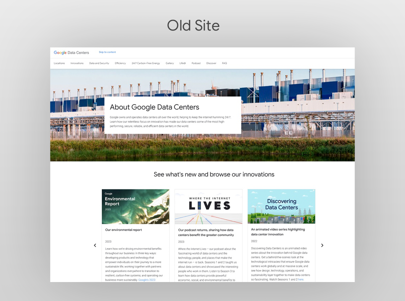
The legacy site was outdated, with clunky navigation, static pages full of technical jargon, and generic photos of equipment and server rooms that spoke only to engineers. Community members and local businesses couldn’t easily find the real-world benefits Google delivers. We needed to reshape the site into a narrative journey—using storytelling and clear UX—to surface key data, simplify technical details for non-experts, and demonstrate how our data centers drive positive impact in people’s lives.
Art Direction & Visual Design
Content Strategy
Research Collaboration
Wireframe Development
Vendor Coordination
To kick off the redesign, a colleague and I led efforts to understand how Google’s data centers impact local communities. We drew insights from community sentiment surveys and held conversations with cross-functional teams across Google—including energy, community engagement, and public affairs. These discussions revealed key goals, questions, and pain points shared by internal partners closest to the work.
We learned there was strong interest in topics like job creation, local economic benefits, and access to information about nearby data centers. People also wanted intuitive ways to navigate to local facility pages. These insights informed a more community-focused content approach.
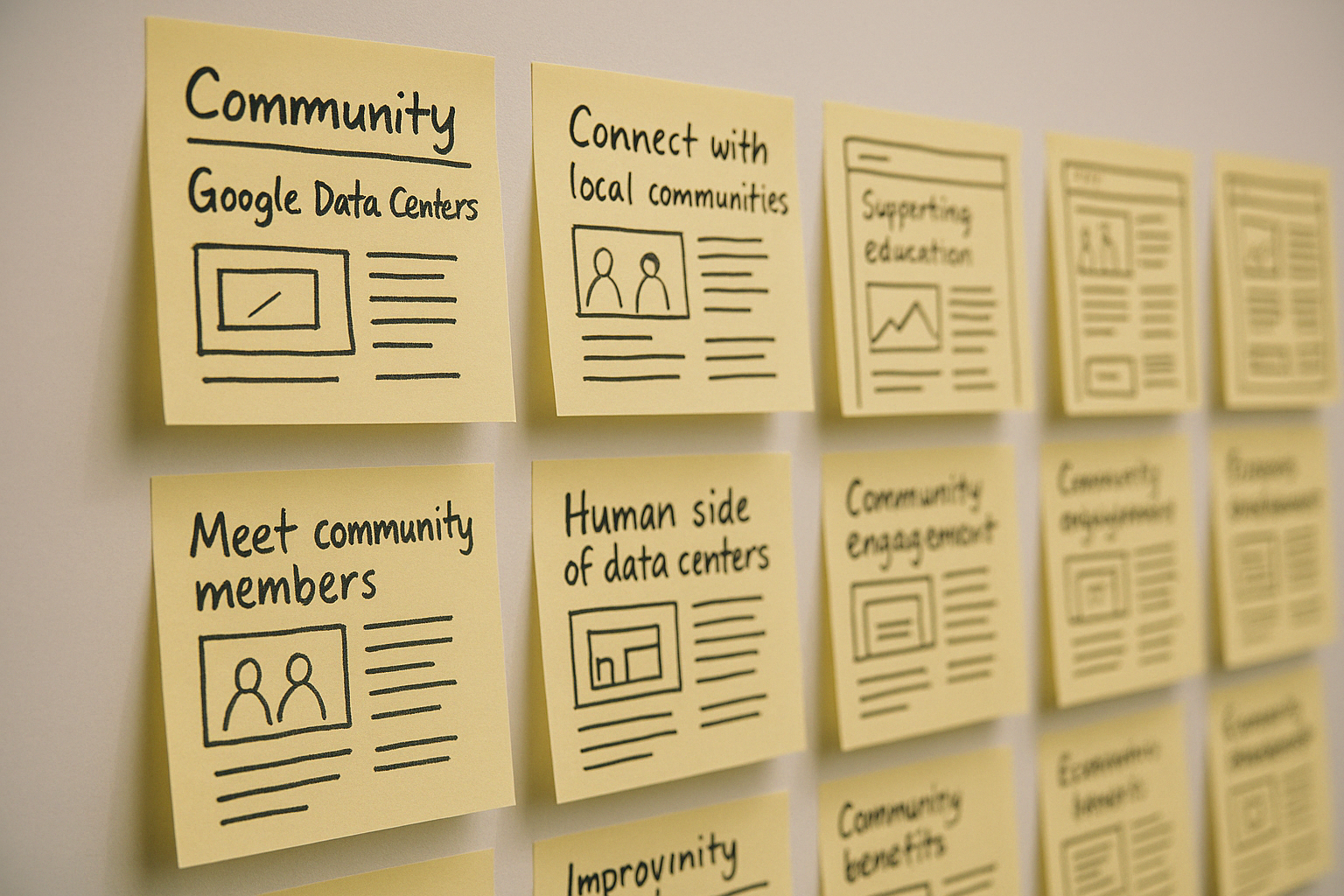
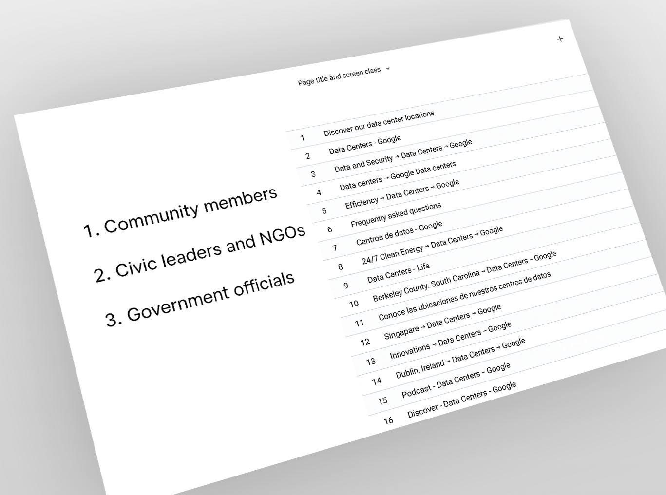
We began with a deep review of the old site—studying its structure, content, and layout—then dove into Google Analytics (ranking pages by click-through rates, search queries, and user flow) to understand exactly what content people were seeking. One of the issues we identified was overly technical copy throughout the site, which made it difficult for community members to locate useful information quickly.
Based on these insights, we reprioritized our content hierarchy: simplified key sections, highlighted high-impact, community-focused statistics up front, and redesigned navigation to reflect real user journeys.
As part of our user-centered design process, we developed detailed personas and mapped their end-to-end journeys to ensure every piece of content and interaction on the site aligned with real community needs.
Persona Development (UX Best Practice)
We distilled our research into three primary personas to capture the diverse goals and pain points of our audience.
Journey Mapping (UX Best Practice)
For each persona, we sketched a journey map—outlining every step they’d take on the site—to validate our information architecture and identify key touchpoints for calls to action.
Sample Personas:
Alicia Rodriguez
Age: 28
Occupation: School Teacher
Primary Goal: Understand how a Google Data Center benefits her community through jobs, educational programs, and local events.
-
David Martinez
Age: 35
Occupation: Founder, Local Environmental NGO
Primary Goal: Evaluate Google’s sustainability practices and identify partnership opportunities for environmental and community projects.
-
Sarah Thompson
Age: 42
Occupation: State Government Official
Primary Goal: Gather economic and environmental impact data to inform collaborations, ensure regulatory compliance, and support local development.
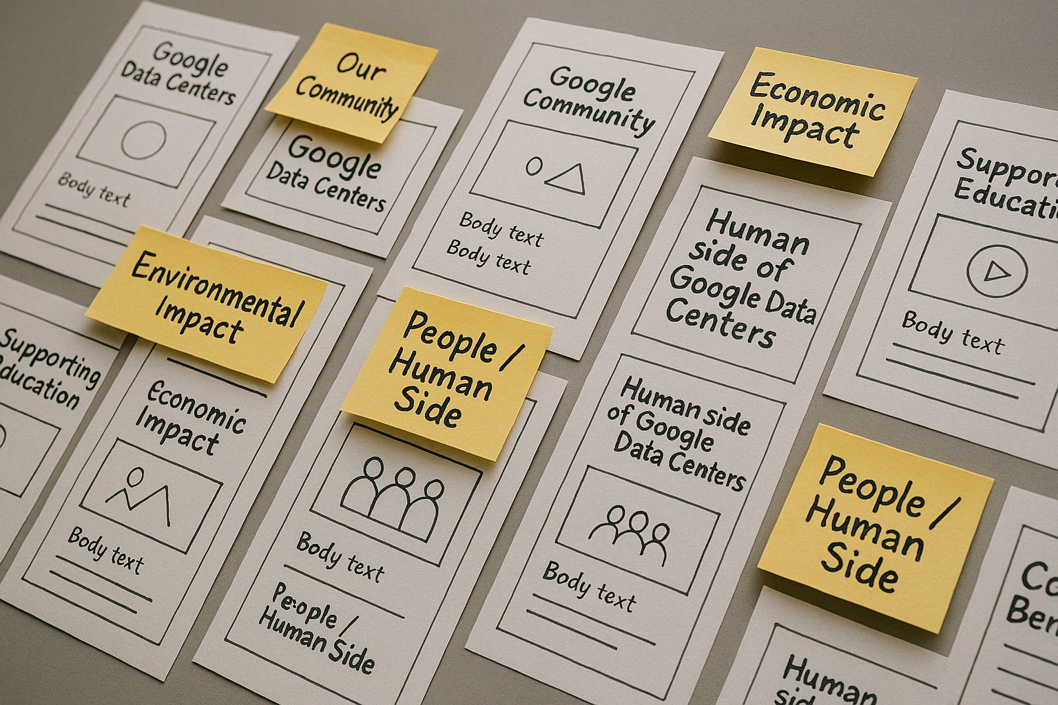
To ensure the site truly served community members, a colleague and I collaborated on mapping out the site architecture based on research findings and stakeholder input. We looked closely at common user needs—like learning about job opportunities, understanding local economic impact, and easily finding nearby data centers—and used those as anchors for the structure.
We iterated on several sitemap versions, continuously referencing UX principles and testing how the navigation would support a natural user flow. Every decision was deliberate: we focused on clarity, relevance, and ease of access, making sure the final structure reflected the priorities of the audiences we identified. The result is a sitemap designed to guide users intuitively through the content, with clear entry points for community-specific information.
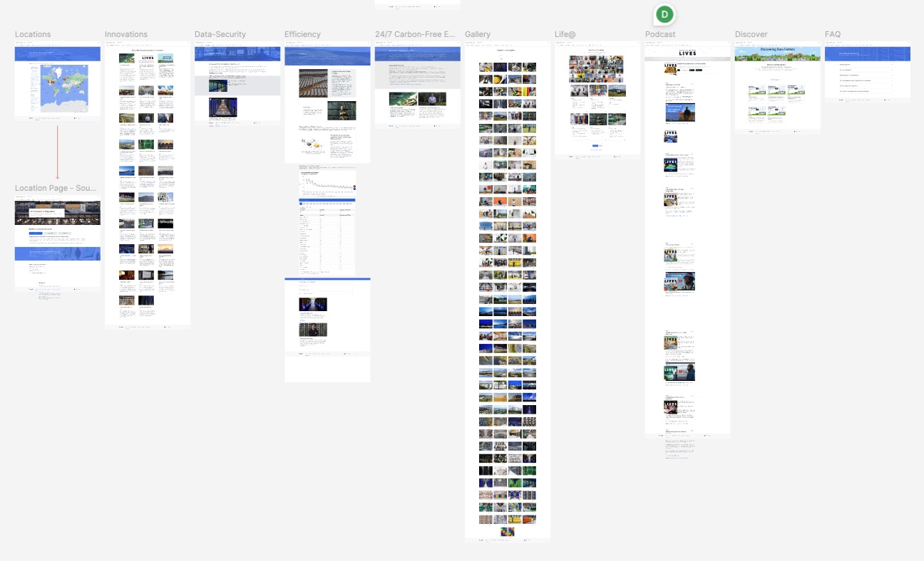
.png)
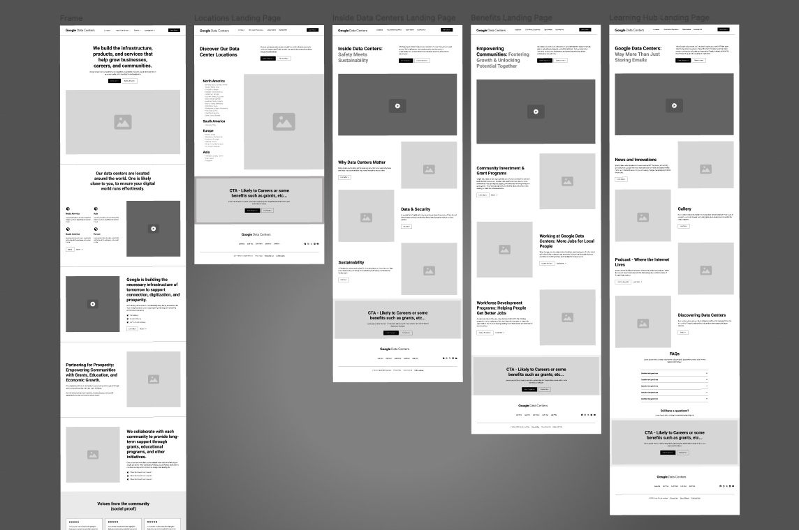
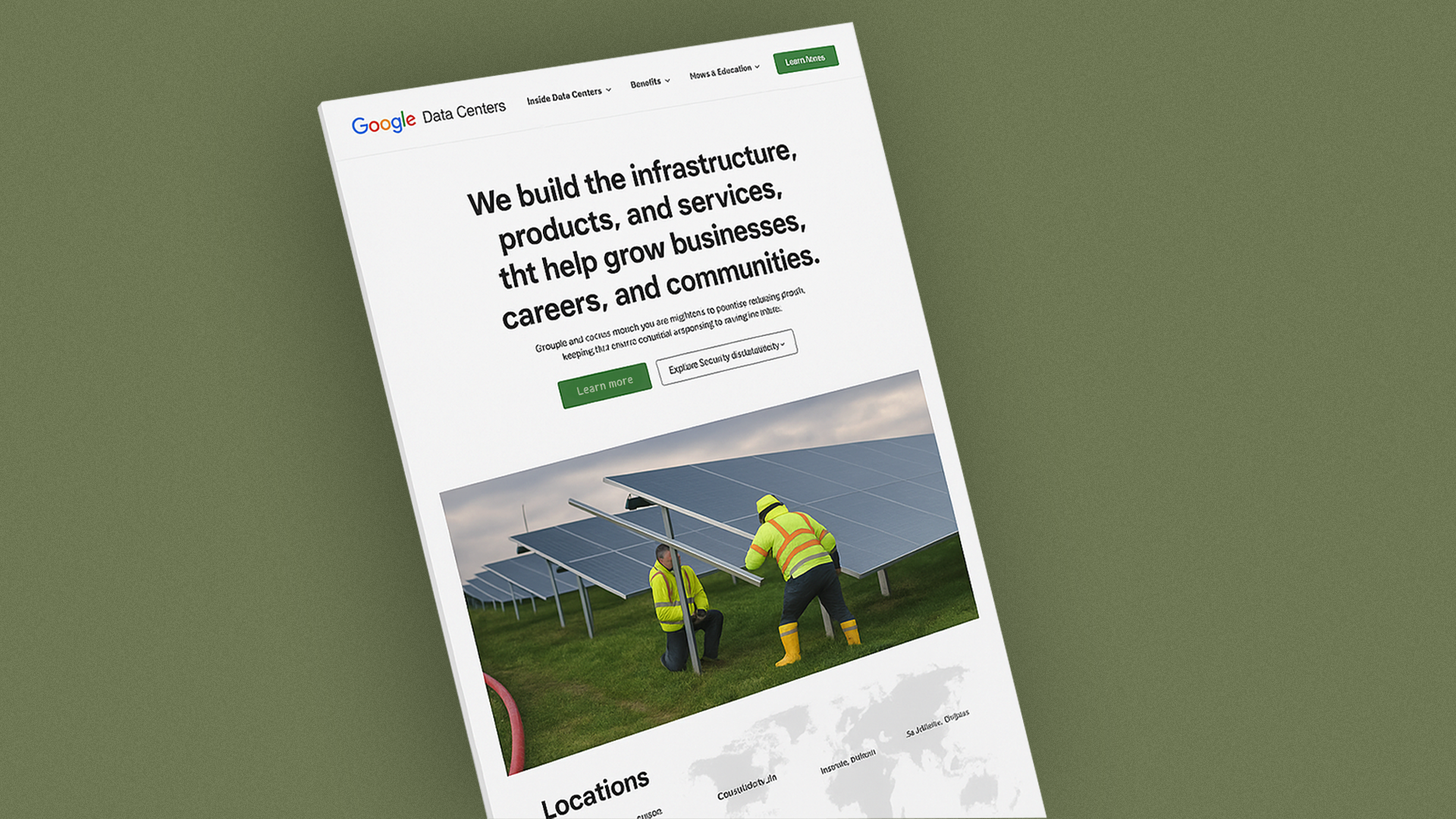
Building on the sitemap, I designed low-fidelity wireframes to bring the structure to life. These sketches explored layout, content placement, and visual hierarchy—defining how users would engage with each section of the site.
The wireframes served as a foundational blueprint for the vendor team, allowing them to hit the ground running with a clear vision. I made sure the layout aligned with our goals of accessibility, simplicity, and storytelling, while also staying adaptable for future content growth. Every element—from headers to navigation to CTAs—was informed by the needs of our community users and shaped to support their journey through the site.
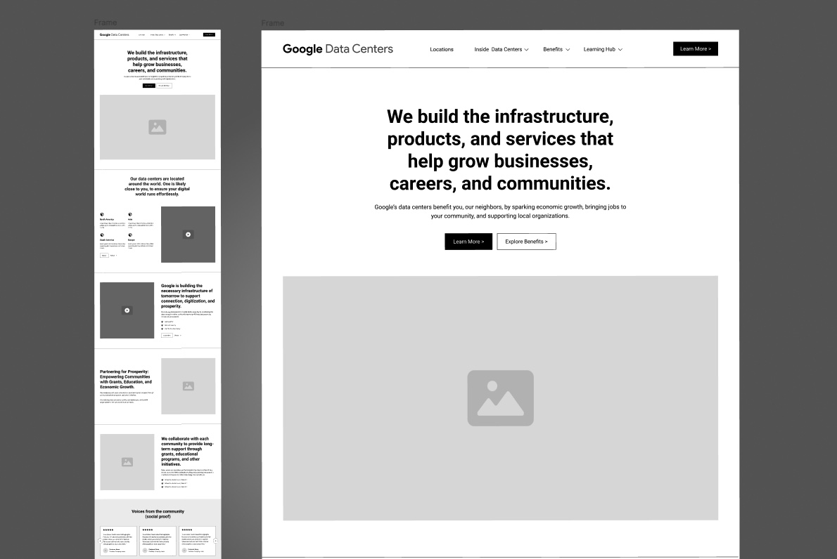
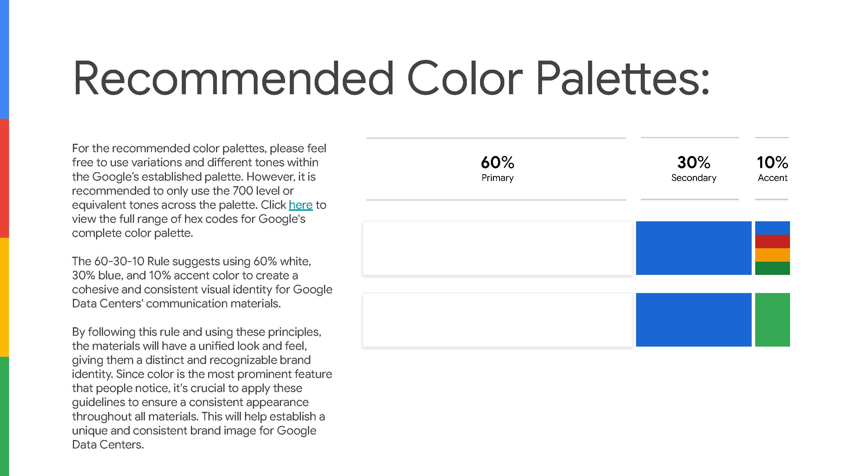
To give Google Data Centers its own distinct voice—while staying true to Google’s overarching brand—I created a “brand-within-a-brand” framework grounded in proven design principles. I applied the 60-30-10 color rule—white as a clean backdrop (60%), Google blue for consistency and trust (30%), and a bold accent hue for emphasis (10%)—all drawn from Google’s approved palette.
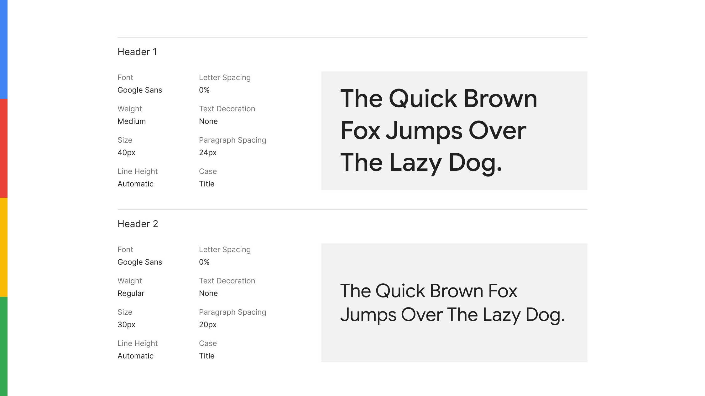
I paired this palette with a clear typographic hierarchy (Google Sans headlines in medium weight, subheads in bold, and 16 px body text) to ensure readability, approachability, and seamless alignment with corporate standards.
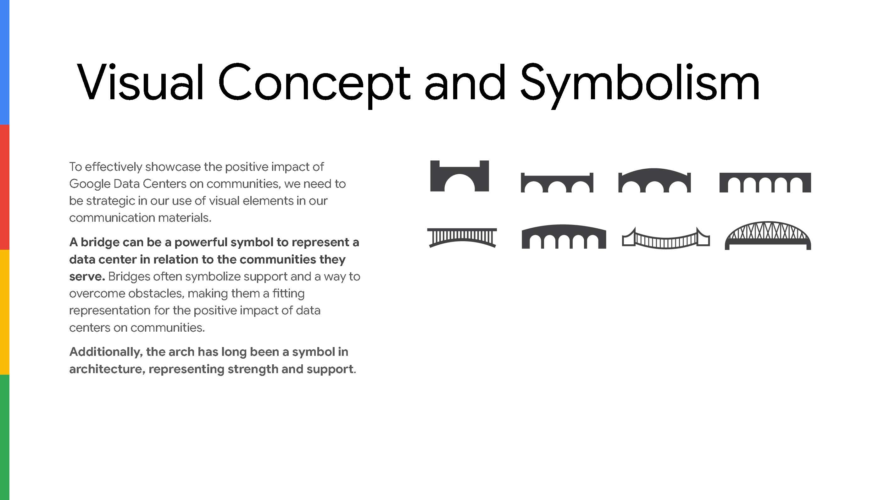
I then translated these guidelines into tangible assets: structural motifs like bridges and arches to symbolize connection and support; rounded corners and fluid shapes to foster warmth and openness; and a slice-of-life photography style that captures candid moments of real community members in action.
By packaging these rules into a concise style guide with annotated wireframes, I handed our vendor a turnkey design foundation—enabling them to implement the site with zero ambiguity and reinforcing a cohesive, human-centered identity for Google Data Centers.
The guidance here was to use truly human-centered photography—avoiding staged “photo-ops,” posed group shots, or close-ups of servers and wires. Instead, we prioritized candid, genre-scene images that capture community members naturally interacting (for example, a small group collaborating around a table, sharing a laugh over real-world tasks). This approach brings authenticity and warmth to the site, reinforcing its focus on people rather than infrastructure.
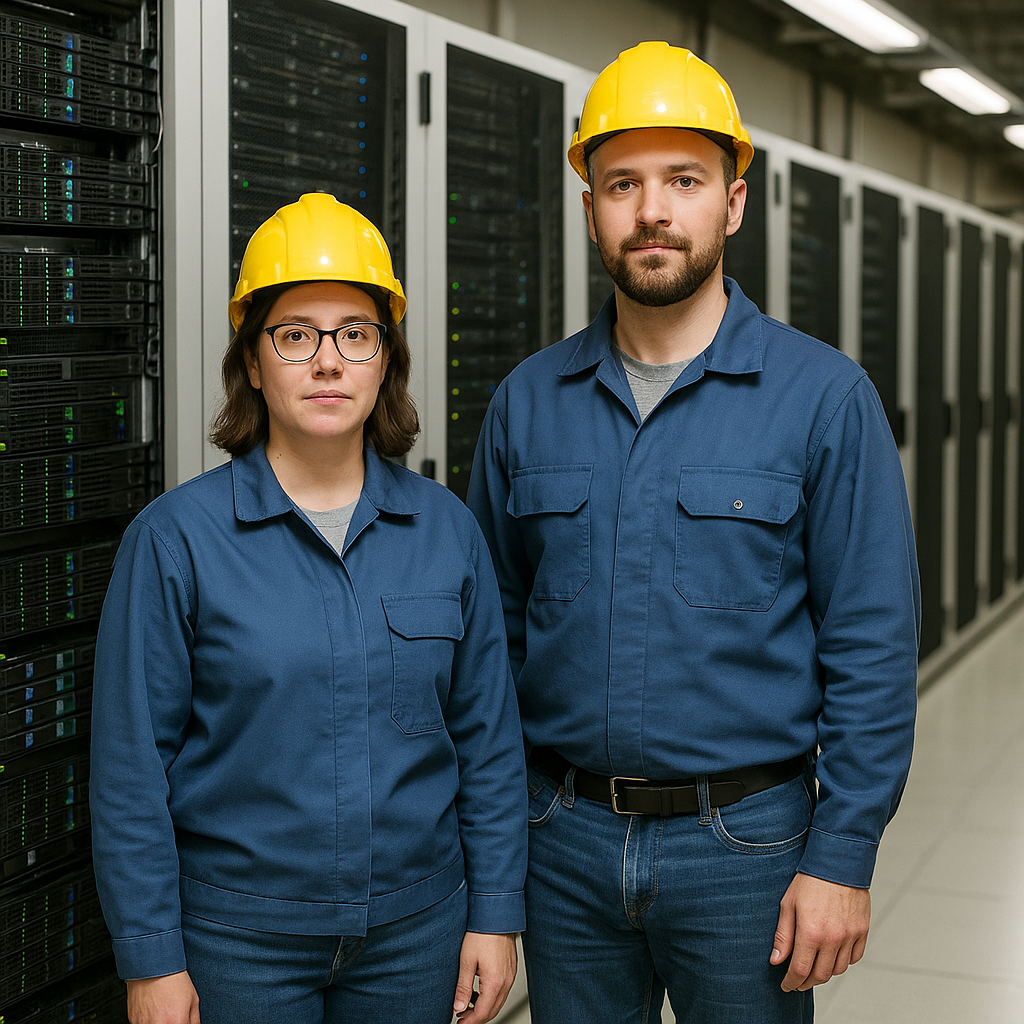
Here are examples of visuals we deliberately moved away from—staged “photo-op” shots and technical close-ups of servers, wires, and equipment.

Here are examples of visuals we’ve moved toward—candid, in-the-moment genre scenes that capture dynamic interactions among people (even outside the data-center setting), conveying authenticity and warmth rather than staged poses or technical close-ups.


After finalizing the brand-within-a-brand framework, I handed off the wireframes, style guide, and source assets to our vendor—walking them through the rationale behind every design decision. I then moved into a full-time role on the Community Development team, where I continued to advise on content prioritization and user engagement with a community-first focus.
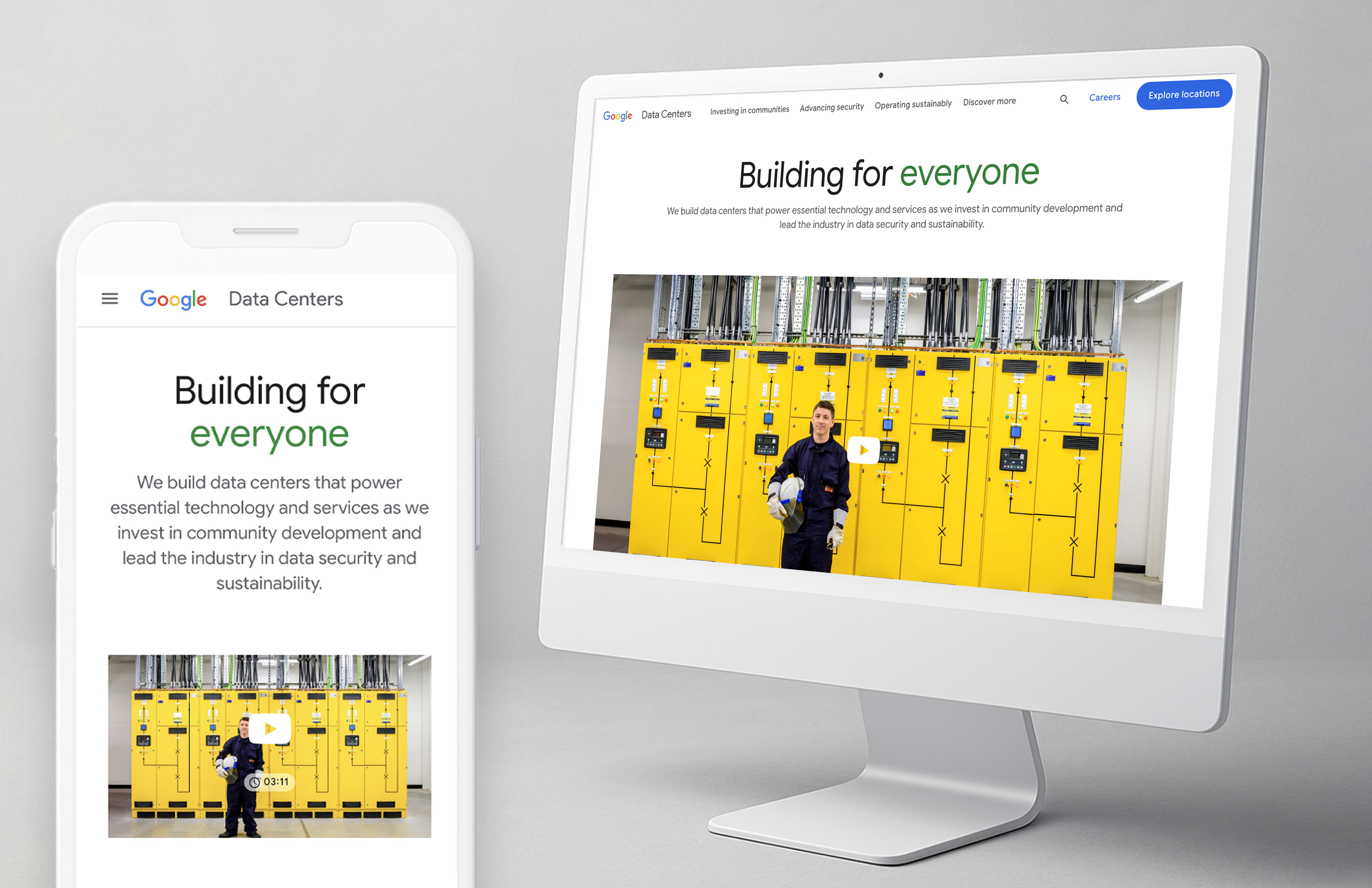
In March 2025, the redesigned Google Data Center website launched, showcasing our human-centered approach and setting a new benchmark for infrastructure that truly serves and inspires communities.